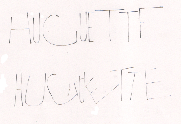
In the morning I wanted to do a piece on black paper (Artagin) with white ink (Copic Opaque White mixed with H2ş) and a speedball C5 nib
Under it I added some Prisma colored pencils.
| Yves Leterme "Drawn Caps for Careful Control Freaks" June 8 & 9, 2013 Page 2 |
Created: June 10, 2013 |
|
|
In the morning I wanted to do a piece on black paper (Artagin) with white ink (Copic Opaque White mixed with H2ş) and a speedball C5 nib Under it I added some Prisma colored pencils. |
|
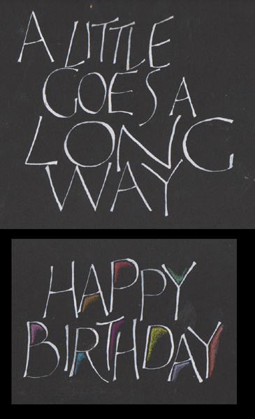
More squeezing and stretching. Yves liked the top piece, but said the bottom one - the tilts were too exaggerated. Still using a pencil. |
|
|
|
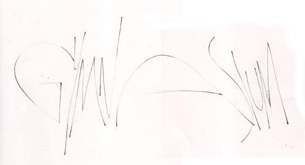
Now we stretched, & squeezed and worked either with a slope creating a star burst type effect and making sure our baseline and top line weren't running parallel. PS the word is : gymnasium |
|
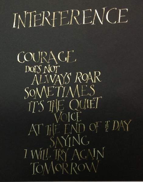
I continued to play on my black paper, this time with Art Quest Interference Mica Color Palette using the Gold for the top word and Duo Green/Yellow for the quote. Pity you can't see the gorgeous colors. PS - Yves didn't like my "ss's" in the last portion, so he demoed what would be more acceptable.
|
 |
|
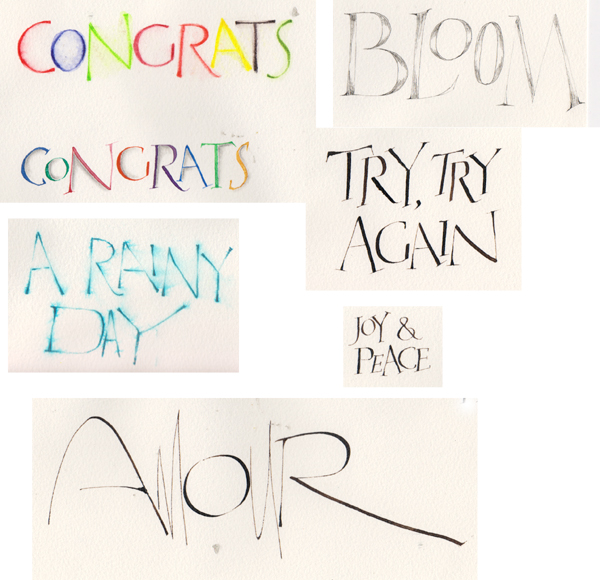
And finally I was playing again. I tried Derwent Inktense watercolor pencils and a water brush. (Top: Congrats) Pelikan water paints brushed onto nib. When dry shadowed with a pencil and paper stump. (2nd Congrats) NoBlot pencil and water again. "Amour" done with Walnut ink and a pointed nib. "Bloom" with a Copic Liner (first time I tried this pen and I love it). Linear Shading the letters. I think I did this one with a #1 Mitchell italic nib and walnut ink. "Joy & Peace" is a test for maybe my Xmas cards this year.
|
|
Please use your computer's back button for previous images Thank You
or click on the Home button to go back to the "Mikes Class Gallery" or "Next" for next page
![]()
![]()
| Home | Page
Index (text only) |
Glass Gallery |
"And
More" Gallery |