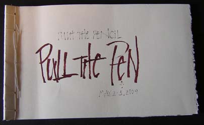
We all started with Arches MBM paper, which is a little thinner than Arches Black cover, and a little thicker than Arches text Wove, and is in between those two for texture. Really nice paper to work on for pencil, walnut ink/ruling pen stuff. It has lines on one side like an Ingres paper, but Peter usually works on the wrong side. If you work on the right side your pencil has a tendency to fall into the grove of the lines. We cut the paper into 16 pieces and when class was done on Sunday, we bound it - stab style - with a loop for hanging. Sorry I did mine a little differently. Big Grin. Peter also made us a personalized ruling pen which is what I wrote the title with.
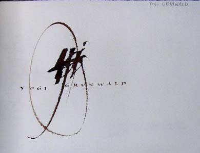
Peter kindly wrote everyone's name on one of their pieces of paper to insert in their journals. This was mine. Love it.
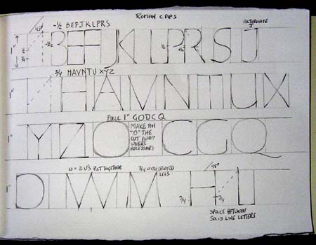
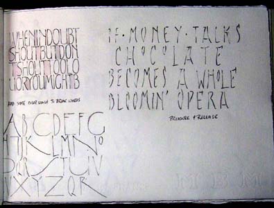
Another trick was the spacing between solid line letters like I & L or H & I etc. Go down to the 3/4 mark on your vertical line, draw an imaginary line at 45 degrees and that's where your next letter starts. Easy Peasy. Don't ask about the other letters...
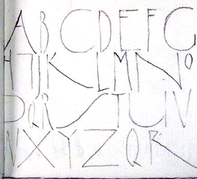
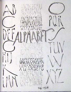
We started of with doing some Roman Caps. As I mentioned before, I'm not enamored with Romans... I've taken several classes of Romans and none of them inspired me. But for some reason, Peter some how simplified some of the rules and a "light bulb" went off.
For instance, doesn't matter what height your lines are, drop a vertical line then just divide it in half and then the lower half in half again (-1/2 and a 3/4 from the top) and using a 45 degree angle draw a line from your marked points to where it intersects with your top line, drop a vertical line and that's the width of your letter.
The letters that fall into the -1/2 (just a touch under the half way point) are B E F J K L P R S
The letters that fall into the 3/4 are H A V N T U X Y Z and that's easy to remember, just say the word between the letters H & U, and then add on the xyz.
Then there are the full letters, the ones that are square, like G O D C Q
And of course there are always exceptions to every rule and we have the M & W
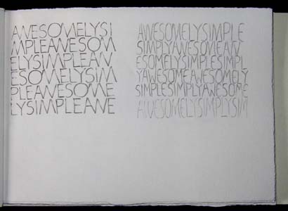
This is a little hard to see, but we started with a pressure and release style letter, doing it with various B and H pencils getting bold letters and ghost like letters.
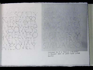
Some we did with large circular "O's" and some with more oval "O's" and their subsequent letter forms based on the "O"
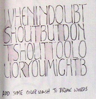
Then we started giving our letters the little secret curve as well as varying the letters - narrow and thick. Making blocks of letters and lightly coloring in the space between the words.
I was just playing between assignments
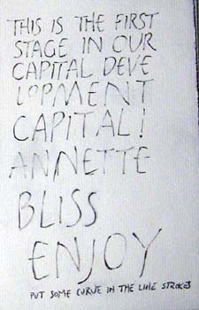
This sample has some curves in the letters.
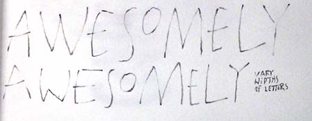
Vary widths of the letters