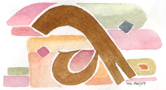
This was another variation of a letter. Notice the notch in the bottom of the trunk of the "a". I also wanted to do some shapes that were a little less rigid, more organic.
|
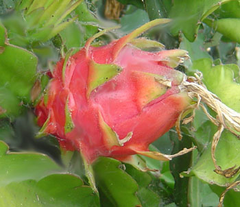
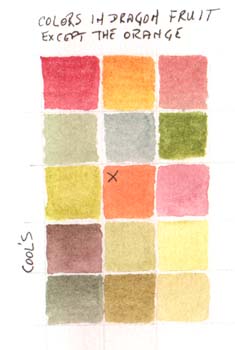
we were asked to bring a fruit or flower or some organic item or photograph of one, so we could dissect the colors within it and try to reproduce them... I choose a dragon Fruit. I love the taste of them and Love the colors. I came pretty close to getting a lot of them, except for that orange in the middle - none of that in my fruit.
|
|
|
|
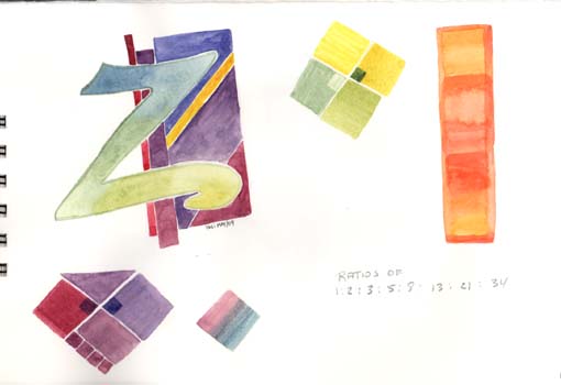
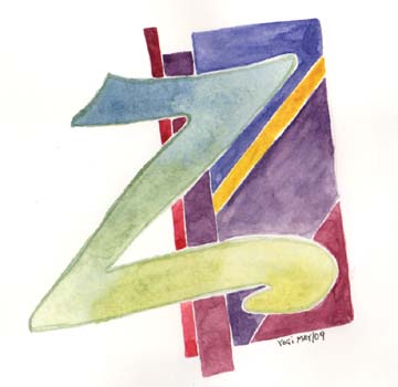
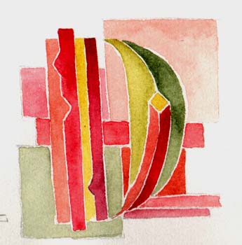
Again I was playing with the "Z"' There was a sample in Adolf's book where he starts with one color and blends along and ends with another. Really nice transition. Mine turned out ok, although the letter form could be improved a great deal. Then there were a few more variations of those interesting squares. Peter also talked a little about the ratios of things, like the distance between your upper lip and your nose, or your lower lip and your chin and it all has to do with this ratio: 1:2:3:5:8:13:21:34 etc |
|
|
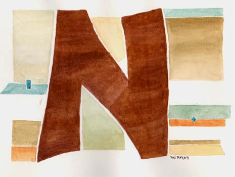
This was a sample of a strong plain letter / color and a muted slightly decorative background |
|
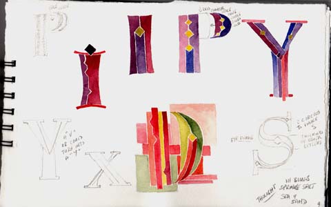
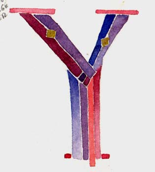
He was giving us samples on the board of letter shapes how to take a monoline Roman cap and add the thick shapes for decorating or painting. Like the "B" or "P" etc would have a slightly larger bowl shape and the weight of the thickness would be on the inside of the bowl. The thicker the truck the less contour space. My "P" above is too pregnant... needs to come in to where my arrow is pointing. With the "V" the left hand portion of the trunk starts to the left of the "V" and tapers down to the point of the "V" whereas the inside portion of that trunk, starts to the right and goes parallel to the "V" line. A "Y" just adds a central trunk. Love the way the "S" is made. Eye your half point, put a line above and below for the thickness of your other letters, Draw 2 circles intersecting and touching the opposite thickness marks, then join up your lines. |
|
|
|
|
|
|
Please use your back button for previous
pages or should you wish to go back to the Peter Thornton Class Gallery please
click on the link below or click next for next web page.
![]()
| Home |
Page
Index (text only) |
Glass Gallery |
"And
More" Gallery |