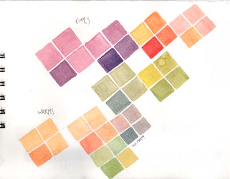
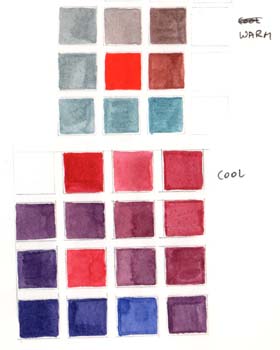
We were asked to bring 3 primary colors of both warm and cool families to class - our choice. I choose for my warms - Daniel Smith, Hansa Yellow Deep; Winsor & Newton Cadmium Red & Manganese Blue Hue. For my cools - Daniel Smith Lemon Yellow, Winsor & Newton Alizarin Crimson & French Ultramarine.
It was recommended to let the colors dry in your palette for a couple reasons, one you use less paint and it's easier to just get a touch of a color.
So we started off with making an X (upper left hand side was my first one), and to make square type blocks in two styles, 1 three blocks the same color and one with some color added to it; and 2, add a minute touch of color to each square and a bit more to the fourth square. I apologize up front for being too quick, but I basically finished all these squares before anyone had finished their first block.
|
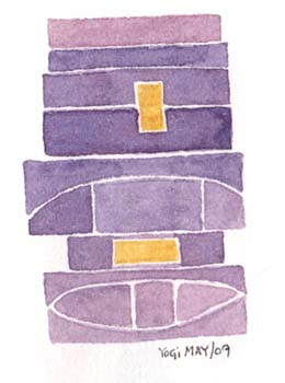
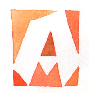
Adolf apparently didn't do things symmetrically, there was always something a little different about his designs, be it a block extending passed the others, or a curve added, or a little piece cut out etc. So we were asked to make a bunch of blocks coloring them in and adding just a touch of color for variation. These are as addictive as zentangles. |
|
|
|
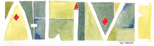
The same goes for these squares. One is a little shorter than an other, or a corner knocked off, or the little rectangles placed inside the square. |
|
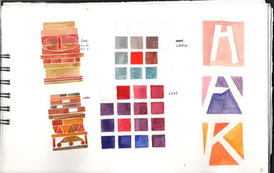
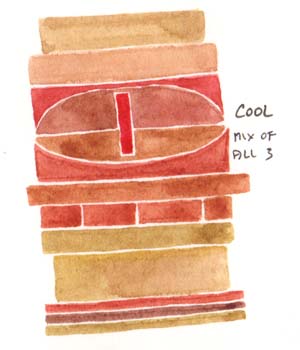
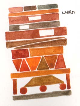
One of my pages with various samples. The blocks again, but I did them in a warm palette and a cool palette. The center squares was an exercise where you start in the middle with a pure color, then slowly added a second color in the one to the right, then more of the second color in the next block above that one, and more of that color in the fourth square to the left of that block and keep going. You'll go through a bunch of greys eventually and should come out with the pure of the second color. I used the cad red & the Manganese for the top one. For the bottom one I used the Alizarin and the Ultramarine then reversing the combinations to come out with what I started with. The right hand samples are; a block with a regular letter, then a block with one that hits the edges and is slightly cut off on the cross bar, then the 3rd one is just playing. |
|
|
|
|
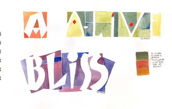
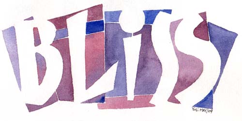
Another of those block letters with some variations to the letter form. The the two words - I was just playing again. The 3 little squares on the right hand side were an experiment. I had colored a letter a brown and wondered what would happen if I put a glaze on top. Those were my results and I left the letter alone. |
|
||
|
|
|
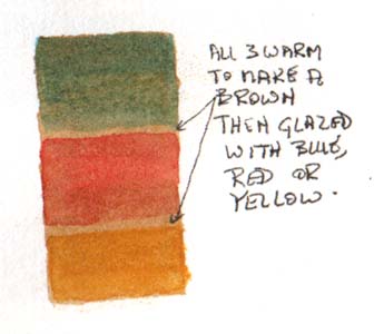
All three of the warm colors were mixed to get the brown, then glazed with the individual colors |
|
|
|
|
Please use your back button for previous
pages or should you wish to go back to the Peter Thornton Class Gallery please
click on the link below or click next for next web page.
![]()
| Home |
Page
Index (text only) |
Glass Gallery |
"And
More" Gallery |