 .
.
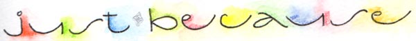
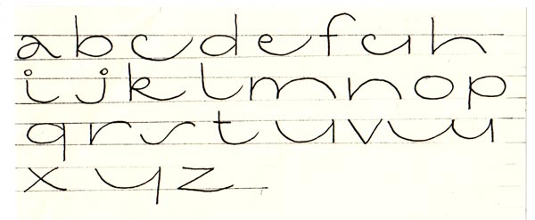
This style of lettering is best done between very very narrow lines (1/4" maximum) to get the elongated look.
I love using it for accent words or on envelopes where I've decorated the first name of the person and then used these letters just under that and keeping to the width of the first name. You will see several samples of this on some of the other pages.
Also check the links below for some samples on my website of the contrast between larger letters and then these.