Background sprayed
Background Stamped |
ID: Tim Holtz Background Technique Plus
By Hand Artists Swap
Created: March 16, 2008 
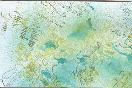
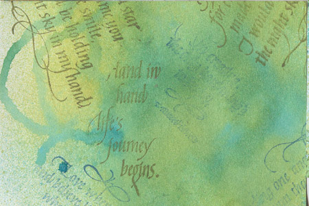
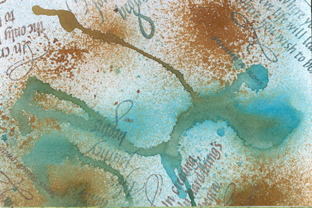
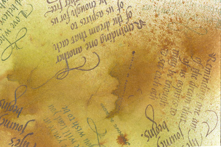
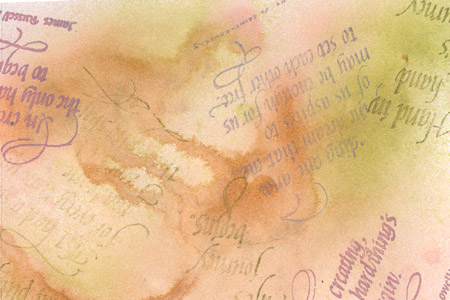
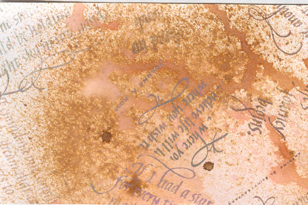
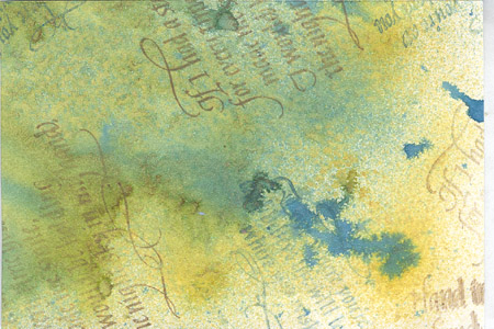
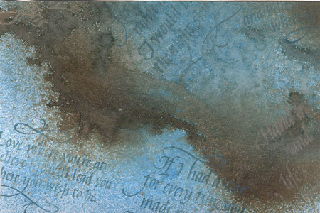
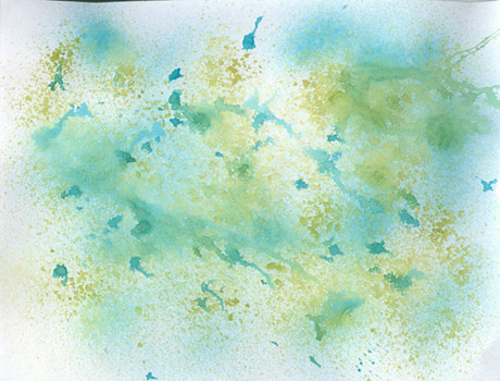
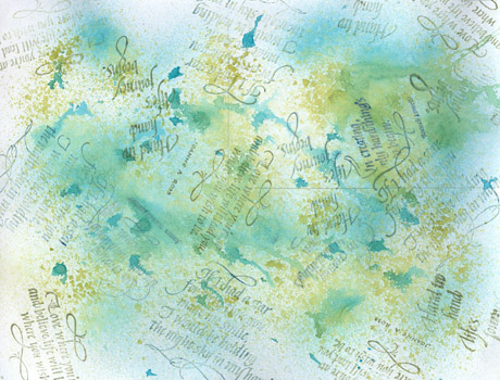
Mix in Ranger’s Mini Spritzer (because of binder in Perfect Pearls, may clog other spritzers) 1 eye dropper full of Distress Ink, ¼ t approx. of Perfect Pearls (they have a binder in them so no need for fixatives), and fill mister ¾ full with water (when cap is put back on, if mister is filled more than ¾ full, it will overflow and no room for shaking and mixing ingredients). Spray lighter color all over onto white cardstock (I used 67lb Domtar white cardstock available @ Staples). Spray with darker color around edges. I removed the spritzer mechanism and dropped dots of darker spray randomly around. Grab the edges of the cardstock and tilted this way and that, to get the puddles moving and create streaks. Dry naturally or with hair dryer. Pencil in your cutting lines so when you are stamping the quotes there are no whole quotes in any one cut up section. Where a stamp will overlap another, mask the already stamped quotes with cut up pieces of tracing paper. I used Versamark chalk stamp pads. See combos below. The two images to the left are the full 8.5" x 11" sheets that I worked on. The first image is just the sprayed background colors. The second image is after rubber stamping the quotes. I then cut it into two 4 x 6" pieces and the rest I punched out as sample tags. All
Re-inkers, Perfect Pearls & Versamark Dew Drop stamp pads are available from Quietfire
Design. All quotes are Quietfire Design rubber stamps. "If
I had a star...", "Love where you're at...",
"In creating...", Hand in hand...", &
"Reminding one another..." |
The images below are one of each background technique of the 4 x 6" section cut out from the larger sheet. Abbreviation Note: DI= Distress Re-Inker & PP= Perfect Pearls, VM= Versamark Chalk Stamp Pad PS: I sprayed the cardstock in the order of the color listed. Even
though #1 & #2 use the same colors, there is a vast
difference in the end result.
#2,
after spraying both colors, I used a tissue to blot excess
wetness, but it removed too much of the color so I re-sprayed.
It’s a more opaque background, whereas with #1, I sprayed very
lightly, leaving more distinct sections and more white
background. |
TH#1 |
TH#2 |
Shabby
Shutters DI with Green Patina PP & Broken China DI with Blue
Patina PP VM: Ocean Depth & Hint of Pesto |
Shabby Shutters DI with Green Patina PP & Broken China DI with Blue Patina PP VM: Ocean Depth & Hint of Pesto |
TH#3 |
TH#4 |
Broken China DI with Blue Patina PP & Vintage Photo with Perfect Bronze PP VM: Ocean Depth & Jumbo Java |
Shabby Shutters DI with Green Patina PP & Vintage Photo with Perfect Bronze PP VM: Ocean Depth & Jumbo Java |
TH#5 |
TH#6 |
Tattered Rose with Blush PP & Shabby Shutters DI with Green Patina PP (If you're looking for a Victorian type of romantic backgr'd, this one is perfect. I love it) VM: Pink Petunia & Hint of Pesto |
Tattered Rose with Blush PP & Vintage Photo with Perfect Bronze PP VM: Pink Petunia & Jumbo Java |
TH#7 |
TH#8 |
Scattered Straw with Heirloom Gold & Faded Jeans DI with Blue Smoke PP VM: Ocean Depth & Jumbo Java |
Faded Jeans DI with Blue Smoke PP & Walnut Ink DI with Heirloom Gold PP (this one is on the darker side but is really nice and moody) VM:
Persimmon
& Ocean Depth |
Return to NittyGritty Gallery
Home | Page
Index (text only) |
Glass Gallery |
"And
More" Gallery |