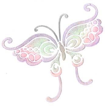
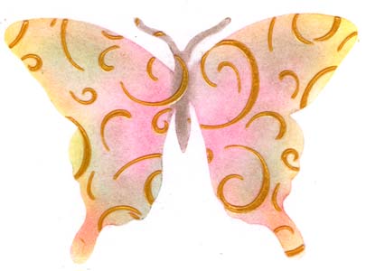
Paste Embossing

Created: September 25, 2008
Modified:

I've had this book called New Dimensions in Cardmaking - using embossing pastes with brass stencils by Lynell Harlow for ages. I had a friend over for a play day and I finally tried many of the techniques from the book.  What I've got below will eventually turn into finished products, but are now just backgrounds or semi finished details. But I wanted to get down in writing what I've done so far. Everything is on regular white cardstock unless otherwise noted. Most of the stencils can be obtained either through Quietfire Design  or Paper Pastimes as well as the Dreamweaver paste. The other pastes can be found at an art store.

I've put a few abbreviations:
QD = Quietfire Design   
PP = Paper Pastimes   DW = Dreamweaver
EP = embossing paste


ID: LL887 - BFly


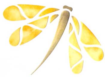
This is part of a DW butterfly stencil available at QD. This technique I learnt from an online friend and finally got to try and it worked. I was amazed.

I colored the butterfly first with Pebbles Pearlescent chalks, then put a thin layer of white EP. When dry the colors can still be seen through the paste but are like a pastel tone. Very delicate effect.

I also added a touch of glitter in some areas.

This is an American Traditional stencil using the off set technique.

I used Pan pastels Ultramarine Blue to color the words. Lifted and put the stencil back down slight offset. Colored the words again with the same blue, then put a thin layer of white EP. I like the way you get the pastel tone of the shadow. In the book it just used the white paste without coloring underneath.


ID: GS139 - Merry Christmas
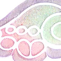
ID: LG627 - Bkgrd

I used a copper metallic cardstock and mixed a batch of white EP with Mars Black acrylic paint. I really like this background.
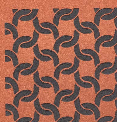
ID: LJ855 - Bkgrd

I used a shiny black paper and translucent EP. When dry I like the contrast of the two shiny surfaces.
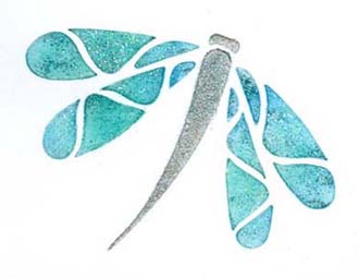

ID: LJ855 - BFly


The gold in the butterfly is the same stencil as the one above in the black background. I think this is one of my favorite samples that I created.

I used Pebbles Pearlescent chalks and a touch of Pan Pastels to first color in the butterfly using a plastic mask from Evolving Images. I then lay the background template over the butterfly mask and used gold EP. lifted everything off and let dry.


I put a layer of white EP and let dry. Then colored it with Pan Pastels and Pebbles Pearlescent chalks. I love the soft coloring in this flower sprig.


ID: LG668 - Dogwood


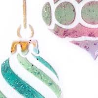
ID: LL468 - Xmas Ornaments

I lay down a coat of Susan Scheewe's White Texture Medium. Let that dry and then colored it with the Pearlescents and the Pan Pastels. Put a thin coat of translucent adding some regular fine glitter and some Ritz Micro Fine glitter. Retouched the hanger sections on each ball with the gold EP.

ID: LM236 - Border

This was done with Golden's light molding paste, when dry, colored in with Pan Pastels in a yellow and violet


ID: SBM033 - DFly #1


ID: SBM033 - DFly #2


These dragonflies are done with a Stencilability stencil. I used Delta Texture Magic Dimensional Paint "Almond". let that dry then colored it with Pan Pastels.

For this one I colored the dragonfly first with Pan Pastels, then a light coat of Translucent and sprinkled some crystal glitter. The body section is done with Deco Art Sandstones Texture Acrylics "Green Mist"


ID: L514 Tea

I applied the white paste to a Canson Mi-Tientes maroon cardstock. When dry cut around the cups and adhered it to a pearlescent white paper then onto a deep rose cardstock. Wrote in the quote "Tea is instant wisdom just add water. Astrid Alauda

I applied the gold paste to a Canson Mi-Tientes maroon cardstock. When dry cut it in half and cut around the cups. Used a metallic gold cardstock as the main background then a cream toned cardstock then adhered the cups.

Quotes: There is no trouble so great of grave that cannot be much diminished by a nice cup of tea. Bernard Paul Heroux

Tea does our fancy aid, repress those vapors which the head invade and keeps that palace of the soul serene. Edmund Waller


ID: L471 - Fall ATCs

I colored in the leaves with Pan Pastels then on two of them I put a coat of white EP (but it was a bit thick so the color didn't show through and I put it aside), the other leaf I put a layer of translucent. I took the two I put aside and added pigment stamp pad and embossing powder, both regular and Opals in various colors layering and thermal embossing between layers. Didn't work out quite like the books, but is OK.

Cut them out including the negative interior spaces, adhered it to the maroon Mi-Tientes cardstock, then onto the Copper metallic cardstock.

Quotes: Here in the autumn of my days I can allow myself to dream. Life never was so sweet it seems.

The winds of autumn blow hard and true. Great oaks bend, and maples too. The burst of flame among the green, portents of flurries yet unseen. Emily Dickinson.

As summer into autumn slips and yet we sooner say "the summer" that "the autumn" lest we turn the sun away. Emily Dickinson

ID: LG629 - Bkgrd

I masked off a rectangle then put a layer of Deco Art Sandstone Texture Acrylic "Green Mist".


This is another of the Stencilability stencils. I used glossy black paper and mixed translucent EP with some Pearl Ex Interference Violet and some with Duo Green/Blue.

ID: SBM023 - Wish

Return to  NittyGritty  Gallery


Home Page Index
(text only)
Glass
Gallery
"And More"
Gallery