>

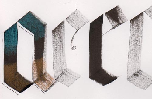
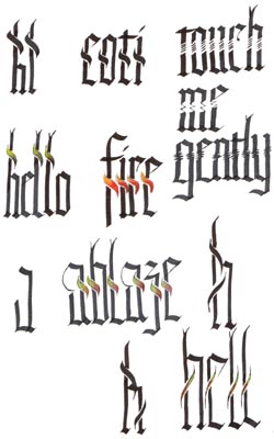
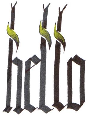
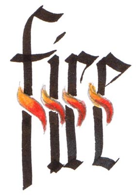
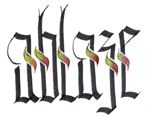
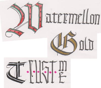
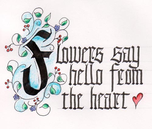
I also love putting decorations around my letters, so this exercise was lots of fun.


Old English with Germanic Flair (Renate Worthington)
February 20 & 21, 2010

Created: February 28, 2010
Modified:

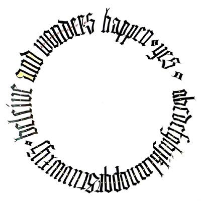
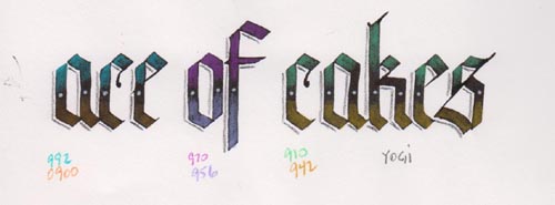
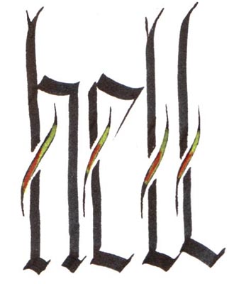
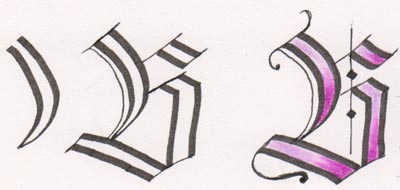
I recently took a class with Renate Worthington, one of our Guild members, in Old English with a Germanic Flair. Fabulous. Everything I new about Old English, Blackletter etc, was found in books. And I was always frustrated with what I produced. But this class was an eye opener, and I feel so much more confidant now. All the images on this page were done during class and are exercises rather than finished pieces.

The things I like the most about Blackletter, is its upright look, its uniformity, the closeness of the letters.

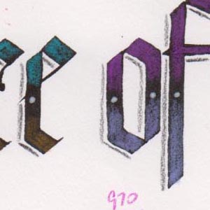
The letters are basically pen angle of 45º and 4 pen widths high. Now here is the most valuable lesson I learned in class. My diamonds on top and bottom of letters were always all over the place. But with this tip, I saw a vast improvement.

For the basic letter: Your pen is at 45º, the left tip of your nib is at the top line, you do your diagonal stroke ending with the right side tip of the pen at the top line and then the downward stroke so the left tip of your pen reaches the bottom line, then  do your diagonal stroke till the right side of your nib touches the bottom line. So in essence your finished letter falls a bit above and a bit below your 4 pen widths height. And now your eye can follow the horizontal lines and all the points line up.

PS: If you're doing actual diamond shapes, when the right side of the nib hits the top line, you need to slide your pen half way to the left then continue your downward stroke. When you hit the bottom slide over half way to the right and continue your diamond.


We were told to use a plate or some other circular item to create a circle to write on. Some like me, used it as a real circle, others wrote on portions of several lines. I was amazed at my results. It doesn't make much sense. I wrote the whole alphabet and had lots of room left over, so started to write words "beleive (I know spelt wrong) and wonders happen" I still had a bit of space left so added the word "yes" and the doodads between alphabet and text and words.

I love colored pencils, so this was right up my alley. We were told to write largish letters and then color them in. I used a Parallel 6.0 as  a dip pen with Sumi ink, and dabbing on a paper towel before actually writing, so got these nice dry brush looking letters. Some a bit more solid than others.

Then colored the upper and lower area with intensity and going to nothing in the center. I tried the technique on the first letter and liked it so did it "for real" on my "ace of cakes" below. Coloring on black is something I've taught in my funky letters classes, but just never tried on real calligraphy.


I was good this time and wrote the number of the colored pencils (Prisma) that I used. BIG GRIN

I love this show. I love his cakes.

I then went in with a Ranger's Inkssentials white pen for the dots. And used a warm grey pencil for the shadow.

Detail


I love these "S" strokes that can easily represent flames or sail or whatever on a quote. So we start of with the downward stroke of the ascender, create the "s" stroke, and continue with the ascender stroke, going back in to fill the little triangle between the stroke and the "S" stroke. I continued playing with it, coloring them and having lots of fun. But I was getting tired of filling in the little triangle. So you'll notice the letter after "Ablaze" has a stroke going in both directions. and that got me thinking, why go against the stroke, why not just flow with it and no filling in the little triangle.

Start your ascender, then start your "S" stroke at the bottom and work upward, continue the rest of your ascender. Easy peasy. And to me it has more of a flame look. I needed to straighten my pen angle to get a thicker stroke, which I have done, so I know it works.

We also did some funky breaks in the letters. Similar to what I learned in Lisa Engelbrechts class.


Ok so the letters could use a little work, I was just playing with the flames rather than concentrating on the letters.


Another good tip was to create a letter with a larger pen size, when dry, place it under your paper and with a smaller nib size (less than 1/2 the size of your larger nib), make the two outer strokes, which will leave a space between the strokes to color in or do whatever. We also put two pencils together to create an outline of a letter. But with the first technique you get the variations within the letter strokes. Now I just have to concentrate on making vertical letters.

The image on the right is just me playing.

Please use your computer's back button for previous images Thank You

Click the link to see pics of other Calligraphy workshop I've taken Calligraphy_Gallery

Or Click the link to see my calligraphy artwork. Enjoy  Calligraphy_Art


Home Page Index
(text only)
Glass
Gallery
"And More"
Gallery