| We learnt a lot of
techniques and used several nibs to try out Pointed Pen calligraphy. All
day Monday we practiced our letter forms. Then on Tuesday the fun began
where we started using them and adding the watercolour techniques as
backgrounds or integral parts of the design. I used a variety of different
paper substrates such as, Arches 90lb hot press watercolour paper, Arches
text Wove, Grumbacher's Pentalic paper, Paper Reflections Full Spectrum black
cardstock (my favorite), black Value Pack cardstock, a few colours of
Fabriano Ingres paper (black, green & blue), 110 lb white cardstock,
65lb cream and white cardstock and for the back cover/binding edge I used
Stonehenge.
The white ink was Bleed Proof White mixed with some distilled water. The brown lettering was Pelikan 4001 "brown"; Caffeine was done with my parallel pen dipped in Pelikan 4001 "black" I did most of the watercolour techniques using a Pelikan watercolour set I've had for about 30 years and Some with Twinkles H2o's. And several of the quotes many of you will probably recognize. My favorites. |
|
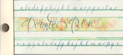
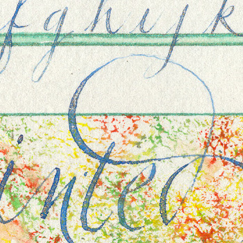
ID: Cover This was done on Text Wove. I sponged the center stripe with various colours (orange, yellow, green). my lines weren't too straight so I added lines using a Sakura Gold "green" gel pen and moving the colour around with my waterbrush. I did the lettering with a bluish gouache and gold powder floating on top. |
|
|
|
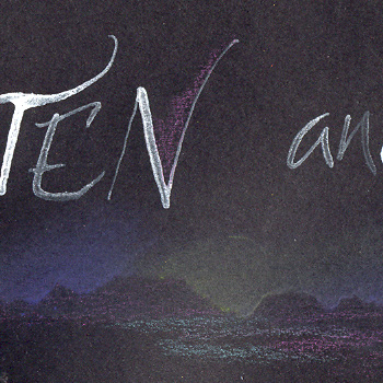
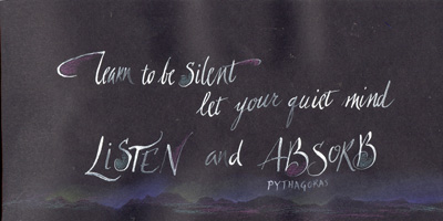
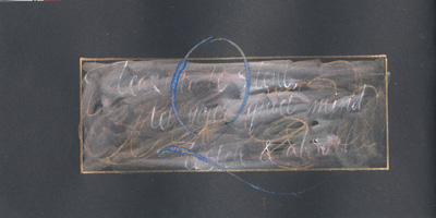
ID: P2 Pythagoras This was done on Spectrum. I used the pastel off the edge of the paper technique. Used some colored pencils very lightly to colour in some letters and a touch at the bottom edge. words: Learn to be silent, let your quiet mind listen and absorb. Pytagoras |
|
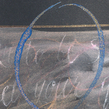
ID: P2 Back "Q" This became a happy accident. I had done the Pythagoras quote and didn't like it. But it now ruined my page. So I scribbled over it with a Sakura Gold "Red" pen then used my waterbrush to smoosh the gel pen around. It blended the white ink too. Then I put the border around it and added a large Cap "Q" in a blue gouache/gold powder mix. This is one of my favorites. |
|
|
|
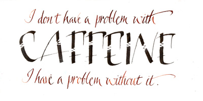
ID: P3 Caffeine This was done on Pentalic. I used the Pelikan brown & black ink. The lettering for "Caffeine" is a cross between Lisa Engelbrecht's Funky alphabet and the Barbara's Pointed Pen Variation Caps. . words: I don't have a problem with caffeine, I have a problem without it. |
|
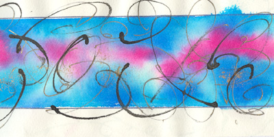
ID: P4 Squiggles This was done on Text Wove. Using a foam brush I wet a thick horizontal line, then using the tip of the brush moved colour into it leaving some white areas. Dropped in some gold powder. Let this dry, then with the back point of a paint brush or similar tool dipped in black ink, made random squiggles. Also added a Gold "Blue" gel pen edge. This page still needs lettering put on it, probably the alphabet along the upper and lower edge. |
|
|
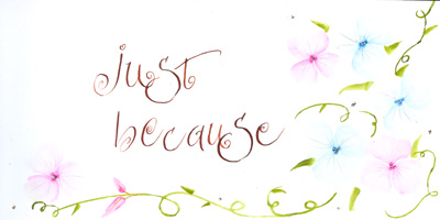
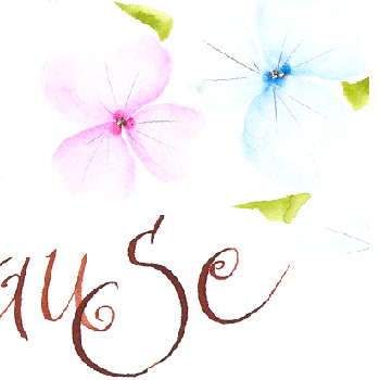
ID: P5 Because This was done on 110lb cardstock. I love this 3 dot floral technique. I use something similar when doing delicate flowers, but this technique is even more delicate. I added very fine pencil lines for petal veins. |
|
|
|
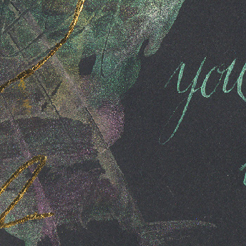
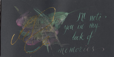
ID: P6 Shakespeare This is another done on the Spectrum. I used Twinkles H2o's for both the credit card technique artwork & the lettering, alternating pink & green "Interference" colours and a bit of gold. Then I used a Sakura "Quickie" glue pen to do my squiggle line and pressed Gold Leaf onto it. words: I'll note you in my book of memories. Shakespeare
|
|
|
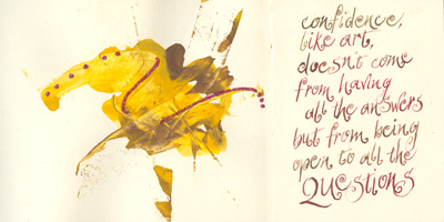
ID: P7 Questions This was done on 65 lb cream cardstock. I used the Pelikan brown, yellow and ochre watercolours and the credit card. Then added some magenta glitter. Pelikan brown ink for the lettering words: Confidence like art, doesn't come from having all the answers, but from being open to all the Questions. |
|
Should you wish to go to the main Calligraphy Gallery please click on the link below. |
Please use your computer's back button for previous images Thank You or click on the Home button below to go to the Pointed Pen Gallery or next for the next page
|
| Home | Page
Index (text only) |
Glass Gallery |
"And
More" Gallery |