>

I will eventually make exemplars of all the fonts I learnt, but that will not be this month... hopefully in March


Lynn Slevinsky's Class January 22, 2011

Created: February 7, 2011
Modified:

I recently took another class with Lynn Slevinsky, and of course it was fabulous. On day 1 we worked in making these 3 cards.

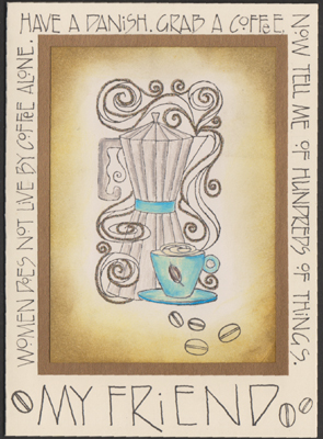
This was a basic cream toned card. We were each given a really pretty printed vintage type image, but I wanted to go in a different direction, so stamped t he coffee pot (Impression Obsession "Coffee with Friends") onto cream paper. Colored with colored pencils and added some bronze micro fine glitter, then sponged around the edges with Distress browns. Layered that on to the provided antique gold paper.

The lettering around the artwork is a font called Harvey. It's got some really nice shaped letters. I used a Micron pen.
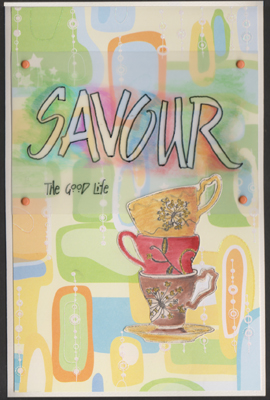
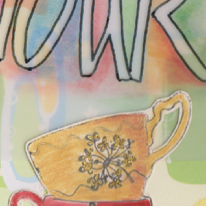
This is an interesting card, not something I usually do. The scrapbook paper was supplied - very abstract and adhered to a white card. Didn't know what direction to go in and then decided to use this cup stamp (Flourishes "Christmas Tea"). Now these cups had Xmas florals on them which I didn't want, so I masked the floral design and stamped only the cup outline onto cream cardstock. I then masked again and stamped the dandelion type flower on each cup. I colored them with Prisma colors, added some gold glitter, cut them out and adhered them to the card on top of the plastic from the next step.

The lettering is originally done on some calligraphy paper using a Cut 'n Dry nib in a disassembled sponge paint brush handle. Oh I really like this type of nib. Has very little flex, which is always my problem when doing brush lettering. Anyway, we dipped the nibs into non waterproof ink (I used Walnut ink). Wrote our words, let them dry, then transferred the outline in reverse to the back of a piece of plastic (on the matte side), with a Sharpie pen - I used an I-Denti pen, colored around the letters with colored pencils. I then wrote "the good life" with the same pen on the glossy side. Attached it to the card with brads.


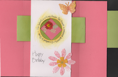
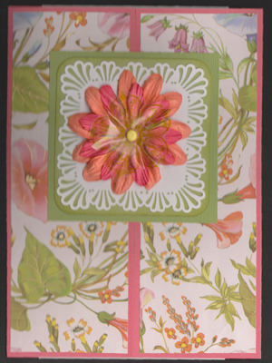
This is an aperture card. I got one from Lynn at Christmas time and created one myself. Nice structure. You can see the other one HERE.

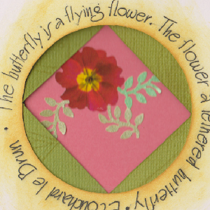
The front paper is absolutely gorgeous. The square is attached to the right side of the card. It has inverted "V" pull out pieces on the inside that make it look like a camera opening and reveals you image underneath. I added the flower and butterfly which I had run thru with an embossing folders and sponged with Distress.

The lettering around the circle is a rendition of Burgert Variations, done again with a micron pen. Sponged color on the edge of the circle opening with Distress.


Please use your computer's back button for previous images Thank You

Click the link to see pics of other Calligraphy workshop I've taken Calligraphy_Gallery

Or Click the link to see my calligraphy artwork. Enjoy  Calligraphy_Art

or click  next for Lynn's Class page 2


Home Page Index
(text only)
Glass
Gallery
"And More"
Gallery