Can you see the difference between the two hearts? the one on the left was real nice until you see the one on the right which has more depth. Just by adding a touch of black shading and a deeper shade of magenta in some areas, makes the heart feel plumper.
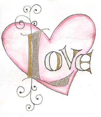
I used a Quickie Glue pen and Glitter Ritz micro fine glitter in Gold, Silver and Warm Highlights. Flourishes are done with a Micron pen.