Twist of the Pointed Pen Booklet (Part 1)

Created: April 10, 2011

Modified:

This is a booklet we created in Barbara Close's class holding the samples we made during the weekend.

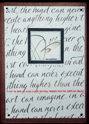
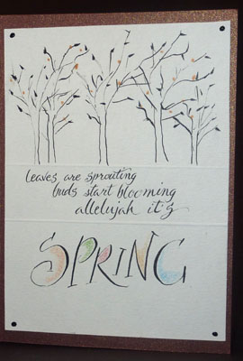
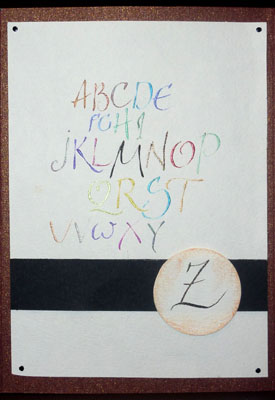
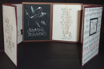
The booklet when opened is 26"w x 6"h. The pages fold in to each other on either side and then a thread wraps around to hold it closed. The cardstock we mounted our pieces to, is a beautiful metallic shimmery coppery brown cardstock.

Everyone added mini brads to hold their papers, I opted to double stick my pages and then added Ranger's Enamel Accents in black (faux brads without the prongs).

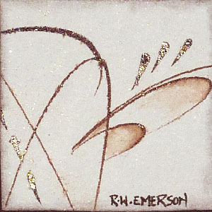
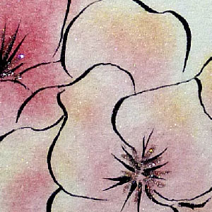
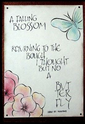
All paper used is Arches text Wove unless otherwise specified. The black is Full Spectrum Color line. I have one piece that is done on watercolor paper (Biggie 140CP)


 The first project we did was to do strokes with our pen in various directions and just getting the feel of our tool - walnut ink. We then used a moist brush to move some of the color in a few areas. Adding a bit of glitz with Shmincke powder in our Walnut Ink. We then used a view finder to pick a spot we liked. You could pick 3 smaller ones, or a medium/larger size or whatever. Cut out the area, then edge it with a graphite pencil and smudge it just to give a hint of shadow.

Place it on your paper, arranging it pleasingly. Then place your text/quote. I opted to fill my page with text, running off the edges, then using my image as a focal point. I did have a slight error... my lines started to veer in an upward direction, and I started to correct it near the bottom, but then I had this large white space - no, no... so I added the red miniscule line of text which repeats the quote. Problem solved and adds that spot of color.


The second project was to draw these kind of bare trees, place them pleasingly and add a quote. They were too much a reminder of winter, so I added some leaves and spots of color...

Used a scoring tool and template to make the 2 horizontal lines. The coloring is done with Prisma colors and I used Sumi ink.

The third project was to do the alphabet and here comes another error...

I did a "Z" under my letters, but it was a really lousy "Z", and I had done it with some gold powder in the Walnut Ink, so I couldn't just paint over it. I cut a black cardstock band, created another "Z" on some scrap Arches paper and cut out the circle, placing it in this strategic spot. I really like this version better. I used various colors of pearlescent paints. The circle was edged with some orangey colored pencil and blended.


The fourth project was to use a magazine photo or artwork and recreate it in pen lines. We traced the image (simple ones work best) then traced it onto our paper, then used our pens and Sumi ink for this one.

The exercise was basically to use a simple design on top or wherever and then do your quote. I opted to run my drawings off the edges - again. I colored them with pebbles Pearlescent chalks and then added a touch of Ritz micro fine glitter (Stardust). I also used a bit of the chalks in a brown tone around the edges.

Please use your back button for previous images or should you wish to go back to the Barbara Close Class Gallery please click on the link below.

Barbara Close April 2011 class Gallery

or click  for page 2 of Twist of Pointed Pen booklet


Home Page Index
(text only)
Glass
Gallery
"And More"
Gallery